case study: design systems
thomson reuters
digital component library
As part of Thomson Reuters' digital brand transformation, I led the design-system work needed to bring consistency, scalability, and governance to a highly complex digital ecosystem. Our team supported 20+ workstreams, leading to fragmentation: teams were building similar components in different places, with different visual treatments, and without a shared understanding of what already existed or where to source it. The result was a disjointed experience for users and a slower, more ambiguous process for designers, developers, and marketers.
The project was a labor of love and learning, the main goal was to create a design language that was easy for the team to successfully adopt.
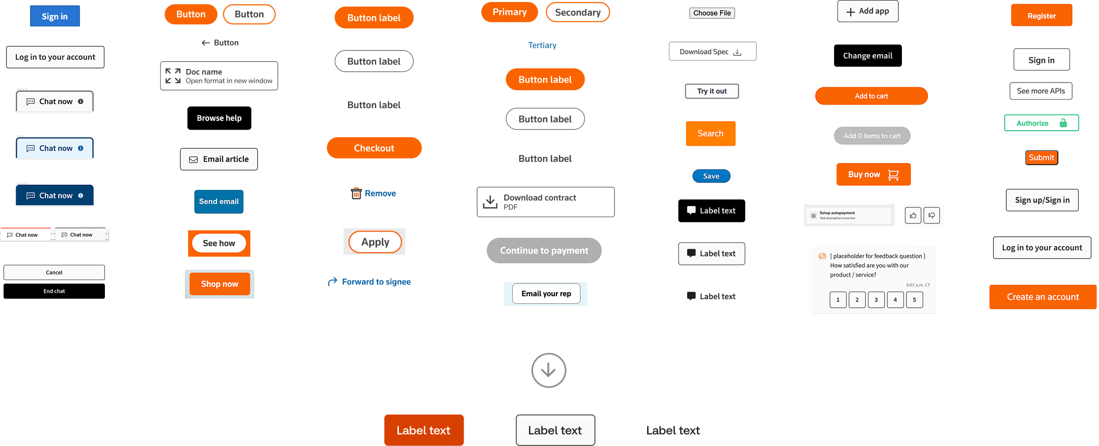
I led a component-by-component audit of our digital experiences and identified opportunities to consolidate patterns into a single source of truth. One of the clearest examples was our button system: more than 30 button variations existed across the ecosystem, creating confusion around which components to use and how they should behave. This allowed the team to move from multiple disconnected design libraries to one unified library that supports different tech stacks, aligns with Marketing brand standards, and remains compatible with the broader organization’s Saffron design system.
I consolidated duplicative patterns into one component set, removing ambiguity for both designers and developers and establishing a scalable and repeatable model that could be applied across the rest of the system.
component by component analysis
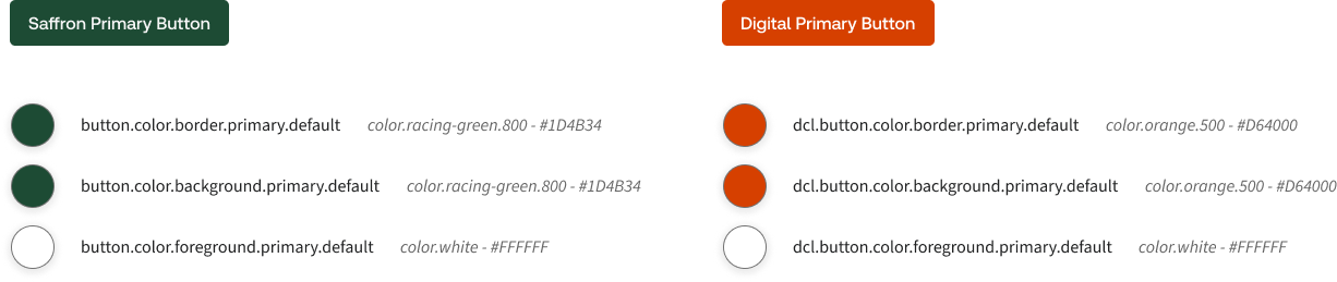
A major part of this work was creating the structure needed for the system to scale. I developed custom design tokens to meet brand requirements without introducing unnecessary engineering churn, documenting them clearly so they could be shared across teams. I also partnered closely with engineering to reduce technical debt, clarify ownership, and establish stronger governance around prioritization, reuse, and implementation. This upfront investment created a more reliable foundation: components could be built once, managed centrally, and scaled across digital experiences instead of being recreated in silos.
Of the 387 Saffron tokens, only 28 hex values needed to be updated, and we introduced 16 new tokens, which can be added to Saffron’s original library. This approach minimized the additional workload for engineers, ensuring that the integration was as seamless as possible.
scalability is the goal
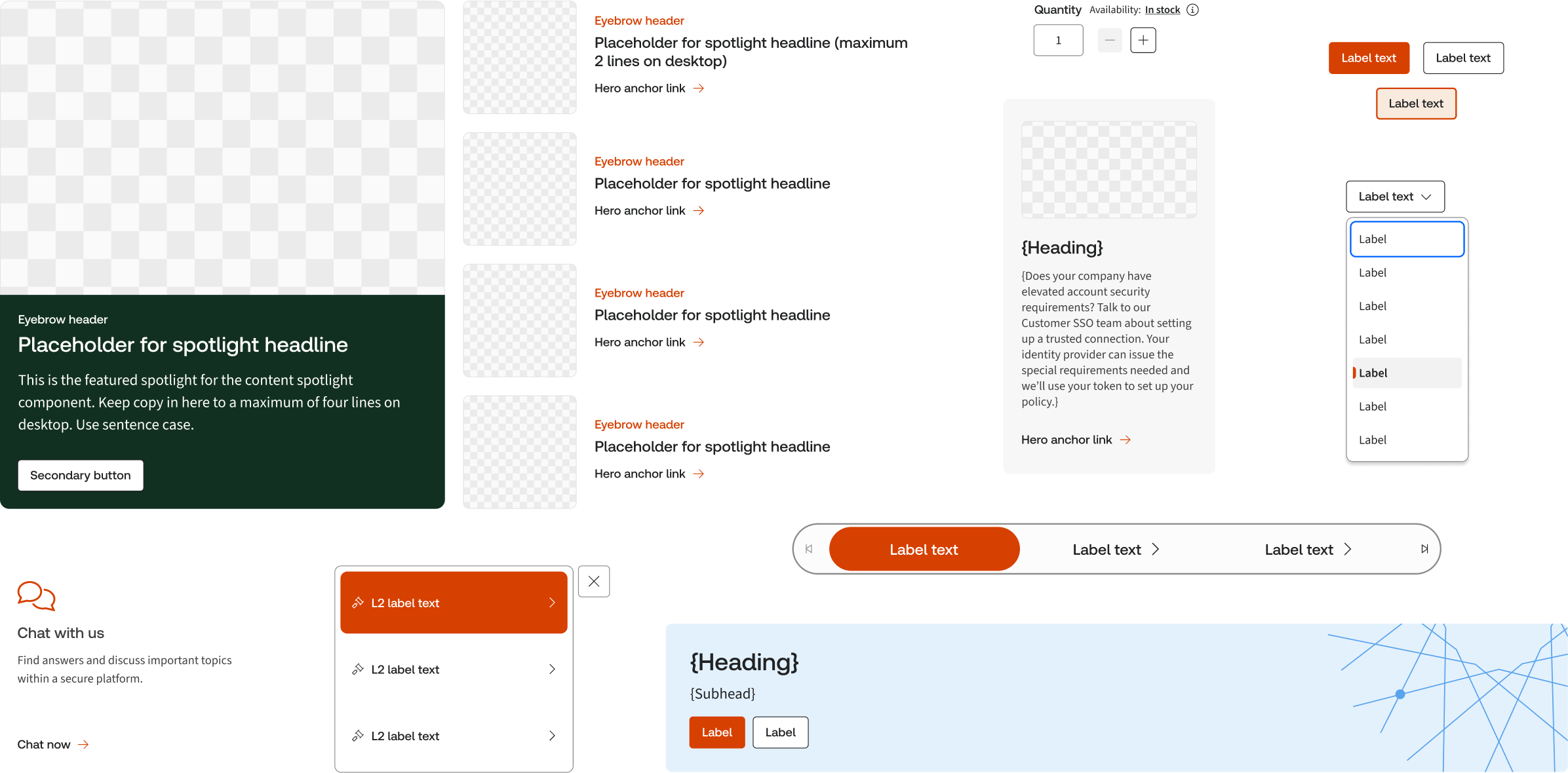
Beyond improving internal workflows, the system created a more consistent and polished user experience. We shipped a standardized branded footer across the digital landscape, replacing fragmented page-level implementations with one reusable component managed by a single team.
By introducing clearer governance, shared standards, reusable patterns, and a unified design language, I helped shift the organization away from fragmented execution and toward a more scalable, system-led approach. The result was a design system that not only improved visual consistency, but also reduced rework, accelerated delivery, strengthened brand adoption, and created a foundation for future digital experiences to be built faster and with greater confidence.
one source of truth
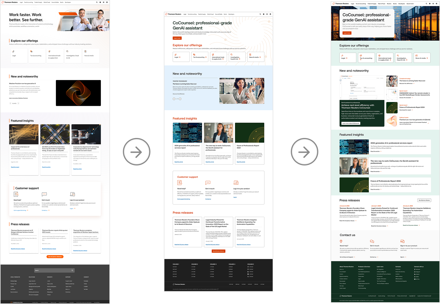
Ultimately, this work was about more than creating a component library. It established a stronger way of working across design, engineering, marketing, and product teams. By introducing clearer governance, shared standards, reusable patterns, and a unified design language, I helped shift the organization away from fragmented execution and toward a more scalable, system-led approach.
By standardizing reusable components and templates, designers were able to work more than 50% faster when building new pages and experiences, and pages are developed in half the time.
new ways of working
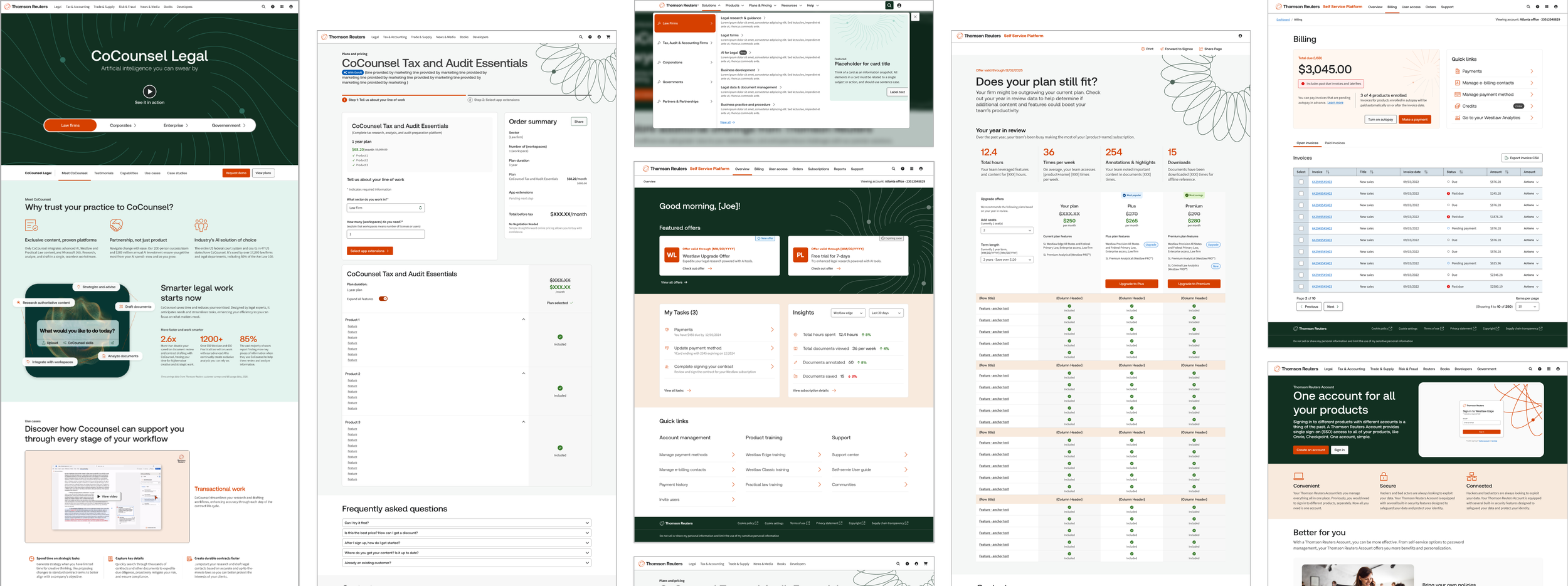
lasting impact
Beyond improving internal workflows, the system created a more consistent and polished user experience. We shipped a standardized branded components and templates across the digital landscape, replacing fragmented page-level implementations with one reusable component managed by a single team.
The first major digital release to launch with the full rebrand reached more than 770,000 visitors and generated over $6 million in marketing pipeline, while user satisfaction for appearance reached 89%.