case study: product design
mega menu revamp
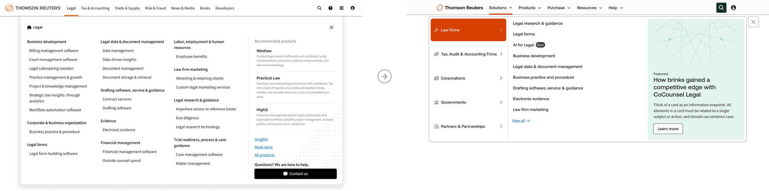
The Mega Menu redesign was a strategic navigation initiative focused on improving how users discover Thomson Reuters solutions across the digital ecosystem. Research showed that the existing navigation did not align with how visitors thought about our offerings, creating friction in findability and slowing users on their path to conversion.
addressing user needs
I led the work directly with an external vendor, helping shape the strategy, define guidelines, provide ongoing feedback, and determine what was necessary for an MVP versus the more complete future-state experience. Because the timeline was tight, we used an "act fast, learn fast" approach: while the full redesign was still in progress, we implemented interim updates that reorganized the menu around solution-based headings and clearer entry points aligned to user archetypes. This shifted the experience away from forcing users into product categories and toward a more intuitive, solution-oriented ecosystem that better reflected real customer needs.
Importantly, the work was measured as it evolved. The interim navigation changes helped validate the strategic direction before the final design was complete, giving the team actionable analytics to inform future iterations. Even with minimal updates, findability for product overview pages improved, with 63% of visitor click-throughs going to those pages and 28% more visitors locating them after using navigation. The new "Purchase" menu also created a clearer path to conversion, contributing to a 32% increase in cart adds from the mega menu.
resolving and clarifying issues with speed
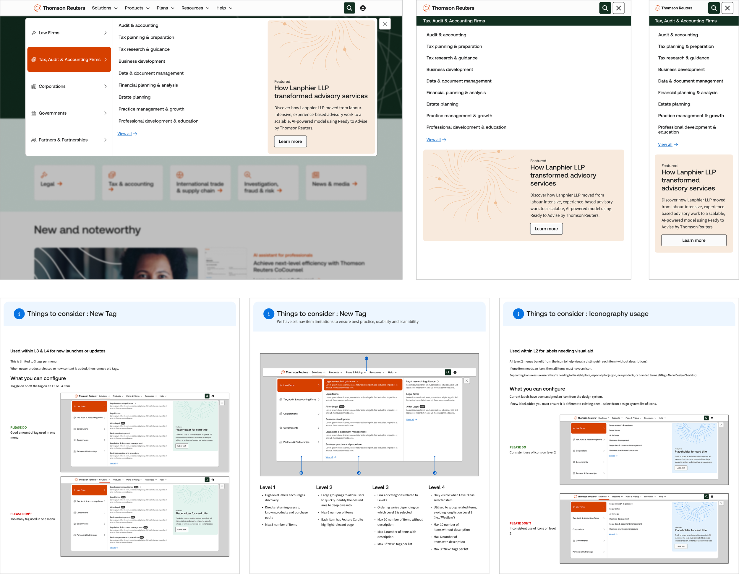
After the vendor's final deliverable was handed off, I reviewed the work and identified critical gaps in accessibility, brand alignment, and build feasibility. Although stakeholders had already signed off, I aligned the team on why those changes were necessary for long-term success and created a focused execution plan. Under my direction, we updated tokens and components, refreshed documentation, incorporated accessibility requirements, and delivered responsive prototypes across three breakpoints. The menu also accounts for regional and localization needs, supports lightweight purposeful motion, and is validated through ongoing analytics, A/B testing, and user insights.
scalability via components
The second phase of this work extended the mega menu strategy across both unauthenticated and authenticated experiences. My focus was to create a consistent navigation model that reduced friction, improved findability, and supported conversion while avoiding one-off solutions across workstreams. I partnered closely with engineering to reuse shared components and tokens wherever possible, ensuring updates can scale safely across the ecosystem.