case study: design systems
pathfinder solutions
I was brought on as a contractor at Pathfinder, a company focused on recovery resources. They provide tools for recovery support — including their Bridge and Companion platforms — serving both care teams and individuals in recovery, respectively. My primary role was design support, with a central focus on building out a comprehensive design system and aligning the organization's branding around a cohesive system built on Material UI, an open-source React component library that implements Google's Material Design.
Rather than building from scratch, the team wanted a solid foundation we could apply the brand to, layer in a custom iconography library, and extend with any necessary custom components and menus. Given the constraints — a fixed contract timeline, a one-person design team, and a small internal team responsible for ongoing maintenance — this approach made the most sense. It also gave us built-in accessibility compliance without requiring a dedicated specialist, and provided developers with a ready-to-use component framework that could get things up and running quickly, a significant advantage with limited resources.
identifying a starting point
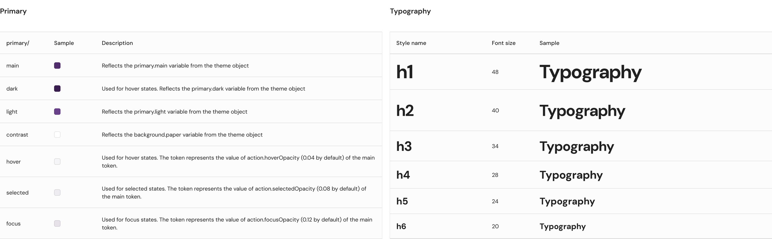
From there, I started with the brand's foundational colors, building out a full palette of shades to support various UI states, and applied the brand's custom typeface and typography variables. With that foundation in place, I was able to establish proper color states and ensure they were applied consistently across components.
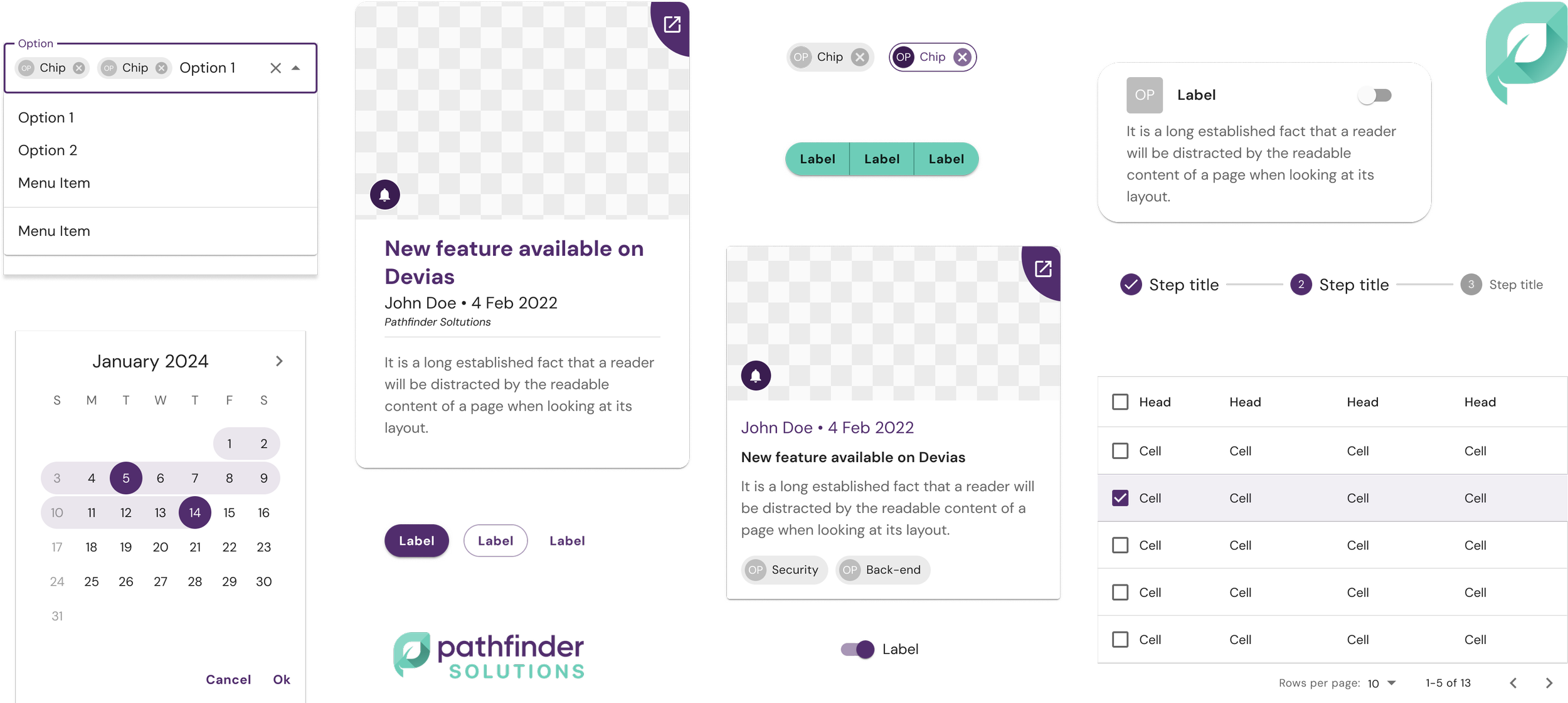
This extended to updating components like cards to align with the brand's visual language, adding the right variants to cover all in-product use cases. Cards, for example, were enhanced with additional UI elements to improve visual appeal, along with more interactive features such as action buttons.
building a scalable system
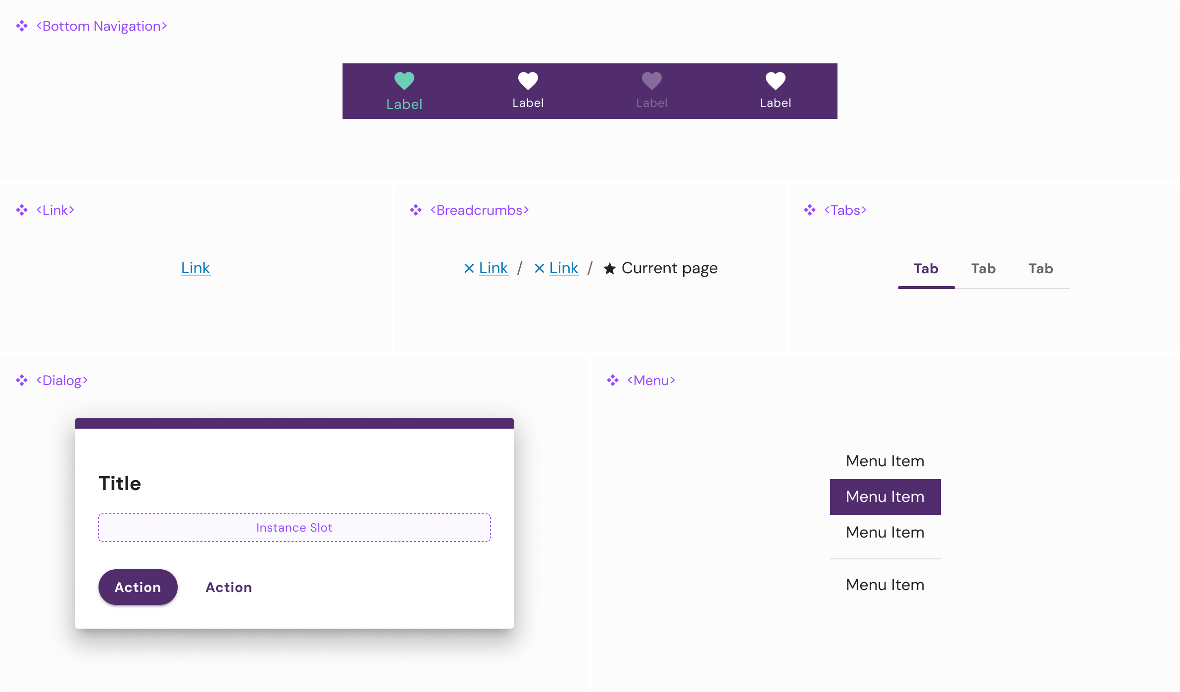
Throughout my time at Pathfinder, I maintained the design library — making adjustments as needed and introducing new components as they were developed. I collaborated closely with the development team to build components that were properly aligned with the library and constructed in a way that was reusable and scalable across the entire product ecosystem.